Friday, 18 September 2009

Eric and Heather ChanSchatz


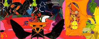
After visiting the Saatchi Gallery I was inspired to look more closely at the work of Eric and Heather ChanSchatz because I was fascinated by their work at the Gallery. It was the use of colours and shapes that attracted me to their work and the graphical nature of their pieces. The work at the Saatchi gallery was all screen printing. They had however started their work by using a variety of media - painting, sculpture, video etc and then had from this created character based drawings from which they selected the images that created the basis for their final artworks. Their final compositions were then screen printed and mirror polished to add to the refraction and stimulation of the pieces. They used rich Pantone colours and bold yet simple shapes to build up these complex and exotic designs. The reason I think that their work was of such interest to me was due to the fact that their end designs looked as though they could have been computer generated; however the reason they were so successful was because of the variety of media used prior to the final piece to create the images. I think this could be an interesting path to take in some of my own work; creating work by painting or sculpting etc and then transporting my final designs/ images from this works into a computer generated piece of graphic design work.

Saatchi Gallery


I have always found the Saatchi Gallery an intriguing place to visit as it is always full with the most bizarre and extraordinary collection of work. This visit was no exception. I found the room downstairs particularly fascinating; it was filled with wax figures of O.A.Ps dressed in different outfits (many related to war) sitting in wheelchairs that were being driven around the room. The outfits lead me to believe that these sculptures were of political leaders in years to come as they were adorned with badges and medals of those who would have belonged to those who were once very powerful people. This was fairly terrifying to say the least, as the wax figures looked so real and i was almost expecting them to jump out of their wheelchairs at any moment. This piece is by a chinese artist called Sun Yuan. I found it strange that the Gallery gave very little information about this piece, and instead expected you to come to your own conclusions in what it was about.

The Saatchi Gallery also contained a number of other very interesting works. One piece that I found very interesting was a sculpture made from a collection of spiral staircases joined together. This looked almost like an optical illusion and it reminded me greatly of our design theory work last year due to the shapes and rotational symmetry the object contained. This piece was by Peter Coffin and was entitled "Spiral Staircase".

The work of Eric and Heather ChanSchatz was also something that interested me greatly due to the use of colours and shapes in their work; i would like to look more closely into the work of these artists.
Finally the last work of art that i felt really stood out was the work by Guerra de la Paz. This artist is famous for using ordinary, yet discarded items in their artwork and this piece was no exception to this as the installation entitled "Nine" was made up from a collection of discarded clothes supported by nine bodies (of which only the feet could be seen). This work is meant to show the strength and values of the community and the history behind the characters displayed. Guerra de Paz is said to view his practice as a type of 'archaeology' where he is able to display historical debris.
Overall i found this trip very inspirational as the Saatchi Gallery is always bound to ignite some creative ideas due to the fact that it holds some of the most eye-catching yet truly random works of art in England.

Tuesday, 8 September 2009

Edward Scissorhands


This had long been one of those films that everyone talked about but I had never seen; and so I decided I would finally watch it. I now know why it is such a talked about film, despite being released in 1990 and I think it is without a doubt because of Tim Burton being such a fascinating director. Edward Scissorhands is a comedy/drama/fantasy/love film that tells a story of an artificial man named Edward who was an unfinished creation with hands made of scissors. Tim Burton was inspired to make this film because of his own childhood upbringing in suburban Burbank in California. He wrote this story as a reflection of himself as an outsider to the generic and conformed lifestyle that was suburban living and wanted to portray his isolation and inability to communicate with people as a child through his work in film. I think it was the fact that the story was so personal to Tim Burton that led him to be so passionate and therefore so successful in creating this film.
It was during the time that Burton was producing Beetlejuice that he hired Caroline Thompson to adapt his story into a screenplay and the fact that they worked so well together in creating Burton's vision meant that every detail was planned considerably. Burton is said to have been influenced by The Hunchback of Notre Dame (1923), The Phantom of the Opera (1925) and Frankenstein (1931).
What i find most interesting about this film is the set. I think that it was so well planned and thought out and really adds so much to the message that Burton is trying to depict. Burton once described Suburbia as "not a bad place. Its a weird place" and he said that when creating Edward Scissorhands he "tried to walk the fine line of making it funny and strange without it being judgemental. Its a place where there's a lot of integrity". The juxtaposition of the suburban lifestyle with the remote Gothic Mansion was conveyed exceptionally well through the use of colours, lighting and set design. It made the suburban setting so green and fresh and perfectly generic with the wives in pastel colours and the houses all the same size and shape contrast so drastically to the dark and eery and very bizarre yet also completely unique and wonderful home of Edward in the Gothic Mansion.
I have always found Tim Burton's work inspirational but i really fell in love with this film for so many reasons; the message behind the story, the way that Johnny Depp plays Edward, and the numerous and innovative design methods used to make this film something very special.

http://www.youtube.com/watch?v=eq2PPFUhfpo

Le Cool London


I found this book by Mat Osman, 2008, in the Design Museum shop and was engrossed by it for so long that i eventually ended up buying it. It is such a wierd and wonderful book that is allows you to see London through the eyes of a Londoner. It was described by The Guardian as "A guidebook for people who hate guidebooks". I think I found it so intriguing as I could relate to the content of the book. It talks of all the places that a tourist would never know about or go to but that the people who actually live in London love and spend there time. It also talks about these places in a diary format so you feel when reading it that you are getting a glimpse into the life of another Londoner. It is a beautifully designed book, that is fun and enjoyable to read as it is full with pictures and interesting typography that give the book so much character; almost like a scrap book. It is designed by award winning designers Jeremy Leslie and John Brown and edited by Mat Osman. I think this has inspired me creatively as it shows a different and unique way of doing something; turning what could be a boring and ordinary guide book to London into something much more personal and exciting by adding a personal touch.

Isis Exhibition, by artist Simon Gudgeon at the Halcyon Gallery

Simon Gudgeon is well known for his minimalistic sculpture he was even described by the president of the Halcyon Gallery, Paul Green as one of "the most talented sculptors working in Britain today". Personally, I have never really been a huge fan of sculpture, however Gudgeon's work seemed to make me stop and think. I think it is probably due to the simplicity of his work which is designed to represent the movement and emotion of nature in smooth forms and simple lines; as it felt as though the collection of his work created an atmosphere when placed in the gallery rather than being just a display of individual pieces of sculpture. I think this also had a large amount to do with the choice of gallery as the Halcyon Gallery is a magnificent building that worked well in displaying Gudgeon's work as it was as open, free and airy as his sculpture. Gudgeon's work has also been displayed in many outdoor settings such as the Lakes in Pallington, Dorset and his signature sculpture entitled Isis is soon to be unveiled in Hyde Park in London. I enjoyed this exhibition as it was something different from what i would usually be interested in seeing; and it made me think about how important sculpture is in creating and changing a setting. I think that i will go and see his work in Hyde Park when it is unveiled to see how it impacts its surroundings.

Gordon's Wine Bar


Gordon's Wine Bar is one of London's hidden gems. It is not one of London's most famous or hectically busy wine bars despite being theoldest wine bar in London. This is probably due to it's unattractive exterior; however, as soon as you go down the stairs through its small pokey entrance you enter a totally bizarre and wonderful building that there is nothing like anywhere else i have ever been. The bar was established in 1890 and still to this day has its original decor, plays no music and serves only wine. It is filled with historical newspaper cuttings and memorabilia that has faded with age.


I found this building so architecturally fascinating and the decor an inspiration. It made me think about how much design has changed in all aspects from the interior to the designs and photography on the old newspaper cuttings displayed on the walls and even the typography used on the signs for thebar and wine bottle labels. It is almost as if you step


back in time when you enter, yet it still has that buzzing atmosphere of a place filled with happy Londoners of all ages enjoying a drink after work. It is located right outside embankment tube station, so if you are ever in the area i would definitely suggest popping in for a drink or even just having a quick look at the interior and memorabilia as it really is something truly unique.


India Landscape and the British Museum


This Indian themed landscape designed for the British Museum's West Lawn in central London "marks the first of five specially commissioned projects celebrating Kew and The British Museum's shared vision of strengthening cultural understanding through creativity and supporting biodiversity conservation across the world." http://250.kew.org/News/KEW_050027.html
This landscape was truly inspirational as it seemed to me such a rarity to find something so culturally diverse outside such a quintessentially English Museum. Many people are unaware of the variety of different historical cultures and exhibitions showing an insight to countries all over the world that the museum actually contains, mainly due to the name of the Museum. Therefore i think that the Landscape outside the museum is important in reflecting the nature of what the museum consists of before anybody visiting actually enters the building. I found the landscape to be a space of tranquility and a place to escape the hectic london world surrounding it. It is filled with an ornate and diverse range of plants that allow you to feel as if you are in a remote place in India. The garden was designed by Kew's Steve Ruddy and Richard Wilford and was inspired by the rich diversity of plants native to India. It contains plants from the temperate woodlands of the Himalayas and subtropical habitats eg. Lotus flowers and also has a scholar tree called an Aistonia Scholaris which is where the slates for British school children in India where made from. It is a place to relax and think, where you can appreciate the natural surroundings of an Indian inspired garden directly in front of one of London's most iconic buildings.